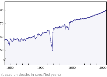
We’ve – I think I can count you in if you’re reading this – all been frustrated from time to time by “life expectancy at birth” type stats which fail to take into account the skewing effect childhood mortality has on the overall figure. If you were born in the 1840s, for instance, your life expectancy at birth would have been rather low – anything from 17 to somewhere in the 40s depending on your background. But so many of your cohorts wouldn’t make it past the various childhood accidents, illnesses etc., but if you did get through, your prospects were much more positive. (More beneath the cut)
Your psychological expectations regarding your own longevity would not have been the 17-40 years of the expectation-at-birth tables. You’d have expected the sort of figure you see in Victorian burial grounds, where most men, at any rate, could look to at least their late 50s before leaving whisky by the chimney for the reaper. (Childbirth made longevity a different subject altogether for married or sexually active women).
But burial grounds represent socially-restricted, geographically-hampered statistical samples. We want the most accurate samples known to humanity etc.
And this is where Wolfram Alpha comes into its own. Click here for the current UK life expectancy at age 10 and related stats.
My statistician’s skills are not what they will be in a couple of year’s time, so I rely on the likes of Matthew Turner and Dan Davies to steer me through.
But even I can see that the chart at the bottom of the page, reproduced below, is unusually interesting. It shows, year by year since the 1850s, how long you could expect to live at age 10. It’s a steady, encouraging, upward curve, arrowing north from the sweat and horror of Victorian Typhoid outbreaks to the light and safety of lingering, pipe-strewn 21st century deaths. But it’s an interrupted curve…
If you remember the discussion here last week about the devastation wrought on Scottish Borders rugby by the Great War – well, here it is in diagram form. Still shocking when you’ve known about it all your life:

UPDATE:
Because the above chart sets out the age you can expect to reach FROM 10 years old, the shape of the curve alters in interesting ways as you increase the starting age. In particular, the ability of world war to slash your life expectancy gradually reduces until it almost disappears entirely. But other things take its place. The chart below is life expectancy at age 50. Something was going on the early 1890s. But what? There was an economic slowdown, but nothing on the scale of the 1870s panic. Any thoughts?

After those kind words I realised that I really didn’t understand life expectancy so I did a bit of research. At risk of repeating what you have said, life expectancy at 10 is simply how long you should expect to live if your probability of dying in each subsequent year is the same as it was for the nation as a whole THIS year. It makes no predictions about medical science etc (so in fact has mostly underestimated actually life expectancy).
In fact it’s pretty similar, if not exactly the same, to saying ‘what was the average age of those who died this year’ or (for life expectancy at 10 or 20 etc) ‘what was the average age of those who died this year who were older than me’.
Hence World War I massively lowers the life expectancy of a 10yr old in 1915 because those aged 16-25 are seeing a death rate of something like 2%. The average age of death in those years fell dramatically. It hardly impact on the life-expectancy at 40, as very few people over 40 died. Of course in fact World War I did not occur again, and so in fact life expectancy at 10 of someone born in 1905 was much higher than the chart suggests. Figure 4 in this PDF shows ‘cohort’ life expectancy which is really ‘life expectancy at birth’ (and which requires modelling for recent years for obvious reasons and so could turn out to be rubbish).
http://tinyurl.com/nhluf4
For your life expectancy at 50 and the drop in 1890, it must have affected the over 50s. In fact Fig 5 from same PDF shows it clearly visible after age 65 and about 1891 before a big leap higher, then decline. Strange.
In fact in chart 5 the standout is the leap higher in 1895 to a (life expectancy at 65) that wouldn’t be beaten again until the 1920s (although of course WWI has a big impact here). It’s the same for both men and women, and I think absent any better ideas might put it down to better/worse data.
On the second graph there’s rather a kink upwards at about 1980. I blame that Thatcher.
Or something to do with the ending of world war i. It looks to be about 1983, which for the 65 year olds would mean they were born in 1918, so perhaps (flu?) infant mortality was very high and the ones who survived were different in some social/individual way. Or maybe it was the Falklands war giving 65yr olds a burst of life-enhancing patriotism…
I remember looking up my expected life span in the Government Actuary tables last year, and being reassured I wasn’t half way through because the life expectancy once you’d got to 37 was 78. I expect to pass the expected half way point between the ages of 39 and 40.
On the over 50s in the 1890s, two hypotheses. One is smoking – I simply don’t know whether that’s a bump caused by the start of the cohort who smoked a lot, which was soon smoothed out by medical advances? Or whether another factor like pollution kicks in then and is also smoothed out? Or perhaps there was an epidemic disease doing the rounds then – the ‘Russian flu’ came through in 1889-90 and perhaps it affected this age group?
Or a combination? Smoking interests me, obviously: I’ve read just about every paper on the subject 1940-1998. Cigarettes, which are the dangerous kind of smoking of course, come in in a big way 1890-1918, and they have the undisturbed time they need to kill – Richard Doll is a hero of the 1950s, not the 1930s.
I’ve checked weather records and can’t see anything that might correlate.
I don’t think it can be something like cigarette smoking as that dip means simply that in 1891 (say) those aged 65 and older on average died at 75, whereas the previous year they died at 76, and the year after 76.5 – it’s hard to see cigarette smoking affecting something for such a short time period and so quickly. Also females are similarly affected.
Somthing like 1890 Russia (or Asian?)’flu would fit the data much better. I note, incidentally, that the US seems to have had a decline from 1890 to 1911.
http://www.infoplease.com/ipa/A0005140.html
See
http://www.flutrackers.com/forum/showthread.php?t=21210